Village Diaries, Part: 1/2 (Achromatic/ Neutral Edition)
Hi! How are you all doing?
I am currently in a design
school, in India, and few days back, they took us to some villages, for survey,
research, industry visits, & stuff… I visited some hand loom industries
there, where I clicked some photographs, that I would like to share with you guys
:)
(Here, I am only sharing the pics
that I found most aesthetically appealing, but if you wish I can post more, later!)
Before beginning, please keep in
mind and try to notice the light, shades, subject of matter, perspective, etc.
in each picture.
Now, have a look:
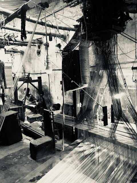
- These are the boards used in a weaving machine. Notice the 'one-point perspective' and how the light slowly fades as we go away in the picture.
- This is one of my favorites. I love how the light is falling in those boards and threads and certain parts are highlighted more than the rest. This really brings a sense of volume in the frame.
- In this one, the placement of the objects is really interesting.
- Pay attention to minute details here. Notice the man sitting behind, and the bulb glowing is obviously the focus of the picture (at least for me! What do you think?)
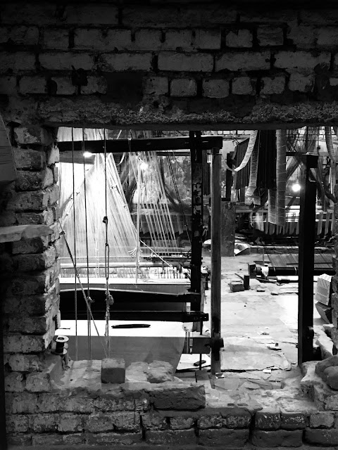
- Look-through the brick window! 'twas fun!
- H A P P Y F A C E S :)
- "That smile. That damn smile." :p
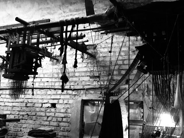
- How those boards are flowing from the top to the bottom is the main attraction.
- Another good one, to study one- point perspective.
- Retro vibes? <3
So, this is my collection of neutral/ achromatic color scheme. However, soon I will post more pictures, with a different color theme, too!
Hope you creative design guys like it! You may please feel free to leave your queries (if any) in comments below and also suggest your intelligent suggestions :)
Follow the blog on all social sites: Facebook, Twitter and Instagram- @ilovesketchart to get latest updates!
Related videos


Comments
Post a Comment