How to edit live Pencil Sketches & drawings using Adobe Photoshop to make interesting compositions?
I had initially started this blog to share my pencil sketches and now that I am so much into photography and digital art, I realized that I almost forgot to share my sketches with you all :(
Writing again, after almost an year, here are some of my favorite pencil sketches that I did in 2018.
Starting of with my best one: this is a live, drapery pencil sketch, where there is a clay sculpture in the center, to have an idea about the texture difference.
Most of the people find it very difficult to sketch drapery as it is, as the delicacy of the fabric is to reflect in the sketch; but it ain't difficult at all, trust me. This whole sketch me 4 hours all over. However, later I had edited the colors a little, using Adobe Photoshop (the blue color of the cushion at bottom and the color of the sculpture). Originally, it was all black and white, but again, to make it look a little more fun and interesting, I made these changes. Apart from this, no other changes were made to the original sketch.
Key to this is "to look", look as much as you can- focus more on the actual object rather than your sketchbook, and make your hand move free.
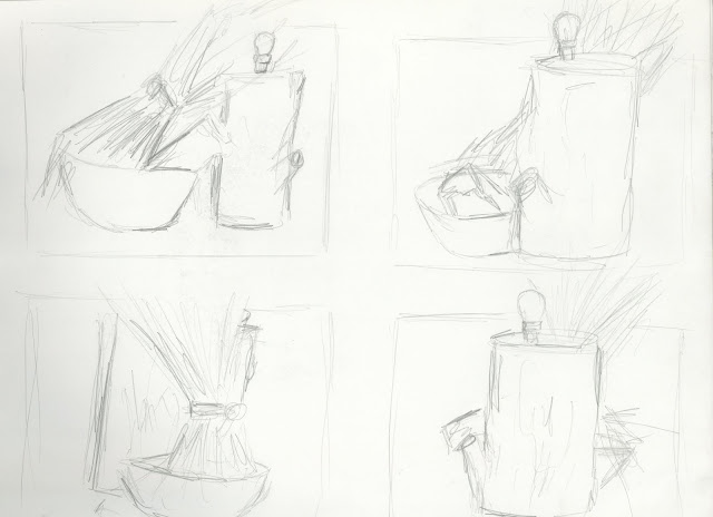
Next comes another live pencil sketch. This was a setup done by my teacher, and we were asked to 'quickly sketch' the whole thing, and we were given about 30 minutes for this.
- I began by doing the thumbnail sketches of the whole thing, from different angles. Then, I chose my favorite angle, and decided to work on that for the final sketch.
- This the final one. Here, again, I had edited the colors of original pencil sketch using Photoshop, to make interesting composition. :P Also, if you notice carefully, you'll find that this final sketch is different from the thumbnail sketches. Yes, the bulb on the top of the log is missing in the final one- someone managed to break it when the teacher wasn't in the studio XD
This is a stippling mouse, looking around for cheese as he could find none. Help him, maybe?
There's a lot more to come. Till then, stay tuned!
Hope you creative design guys like it! You may please feel free to leave your queries (if any) in comments below and also suggest your intelligent suggestions :)
Follow the blog on all social sites: Facebook, Twitter and Instagram- @ilovesketchart to get latest updates!
Video you may like


Colored sketching is really mind-blowing for a layman like me...nice post adtea a while on core art....keep it up
ReplyDelete